2.6. Plotting
2.6.1. Drawing gridded sections
The drawing of gridded sections is achived by using the pypago.plot.plot_dom_mask() function. It is done as follows:
import pypago.pyio
import pypago.plot
import pylab as plt

# change the section colors without going into the code
from cycler import cycler
plt.rcParams['axes.prop_cycle'] = cycler(color=['cyan', 'magenta', 'gold', 'orange'])

grid = pypago.pyio.load('data/natl_grid.pygo')

data = pypago.pyio.load('data/natl_datadom.pygo')
mask = data[0].mask

# loading of the gridded section domain
sections = pypago.pyio.load('data/natl_datasec.pygo')

plt.figure(figsize=(8,6))
plt.subplots_adjust(top=0.95, bottom=0.05, hspace=0.3,
                    left=0.05, right=0.95)

plt.subplot(2, 2, 1)
pypago.plot.plot_dom_mask(grid, None, None)
plt.title('Grid mask')

plt.subplot(2, 2, 2)
pypago.plot.plot_dom_mask(grid, sections, None)
plt.title('Grid mask + sections')

plt.subplot(2, 2, 3)
pypago.plot.plot_dom_mask(grid, None, mask)
plt.title('Grid mask + domain mask')

plt.subplot(2, 2, 4)
pypago.plot.plot_dom_mask(grid, sections, mask)
plt.title('Grid mask + sections + domain mask')

plt.savefig('figs/plot_dom_mask.png', bbox_inches='tight')
In [1]: import os

In [2]: cwd = os.getcwd()

In [3]: print(cwd)
/home/barrier/Codes/pago/pypago/doc_pypago

In [4]: fpath = "examples/plot_dom_mask.py"

In [5]: with open(fpath) as f:
   ...:     code = compile(f.read(), fpath, 'exec')
   ...:     exec(code)
   ...:
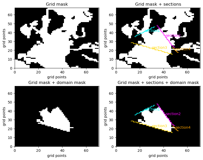
Fig. 2.20 Results of grid, gridded section and domain plotting
2.6.2. Drawing data sections
The drawing of data on gridded sections is
achived by using the pypago.plot.pcolplot() (for pcolor plots) and
pypago.plot.contourplot() functions. It is done as follows:
import pypago.pyio
import pypago.plot
import pypago.misc
import pylab as plt
import numpy as np

# change the section colors without going into the code
from cycler import cycler
plt.rcParams['axes.prop_cycle'] = cycler(color=['cyan', 'magenta', 'gold', 'orange'])

# loading of the gridded section domain
sections = pypago.pyio.load('data/natl_datasec.pygo')

idsec = pypago.misc.findsecnum(sections, 'section2')
sec = sections[idsec]

# conversion of velocity into cm/s
sec.vel *= 100

plt.figure(figsize=(14, 8))
# draw temperature as pcolorplot
cs, cb = pypago.plot.pcolplot(sec, 'temp', istracer=1)
# add colorbar label
cb.set_label('Temperature (C)')
# modify colorbar limit
cs.set_clim(0, 14)
# draw temperature as contourplot
cl = pypago.plot.contourplot(sec, 'temp', istracer=1, levels=np.arange(0, 20, 2), colors='k')
# add label
plt.clabel(cl)
# add grid
plt.grid(True)
plt.savefig('figs/section_temp.png', bbox_inches='tight')

plt.figure(figsize=(14, 8))
# draw salinity as pcolorplot
cs, cb = pypago.plot.pcolplot(sec, 'salt', istracer=1)
# add colorbar label
cb.set_label('Salinity (psu)')
# modify colorbar limit
cs.set_clim(34, 36)
# draw salinity as contourplot
cl = pypago.plot.contourplot(sec, 'salt', istracer=1, levels=np.arange(34, 36.5, 0.25), colors='k')
# add label
plt.clabel(cl)
# add grid
plt.grid(True)
plt.savefig('figs/section_salt.png', bbox_inches='tight')

plt.figure(figsize=(14, 8))
# draw velocity as pcolorplot
cs, cb = pypago.plot.pcolplot(sec, 'vel', istracer=0)
# add colorbar label
cb.set_label('velocity (cm/s)')
# modify colorbar limit
#cs.set_clim(-5, 5)
# draw velocity as contourplot
cl = pypago.plot.contourplot(sec, 'vel', istracer=1, levels=np.arange(-6, 7, 2), colors='k')
# add label
plt.clabel(cl)
# add grid
plt.grid(True)
plt.savefig('figs/section_vel.png', bbox_inches='tight')
In [6]: import os

In [7]: cwd = os.getcwd()

In [8]: print(cwd)
/home/barrier/Codes/pago/pypago/doc_pypago

In [9]: fpath = "examples/plot_section_data.py"

In [10]: with open(fpath) as f:
   ....:     code = compile(f.read(), fpath, 'exec')
   ....:     exec(code)
   ....:
The time average of the temp is plotted.
The time average of the temp is plotted.
The time average of the salt is plotted.
The time average of the salt is plotted.
The time average of the vel is plotted.
The time average of the vel is plotted.
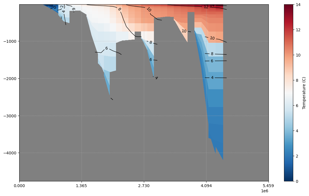
Fig. 2.21 Plotting of mean temperature on gridded section
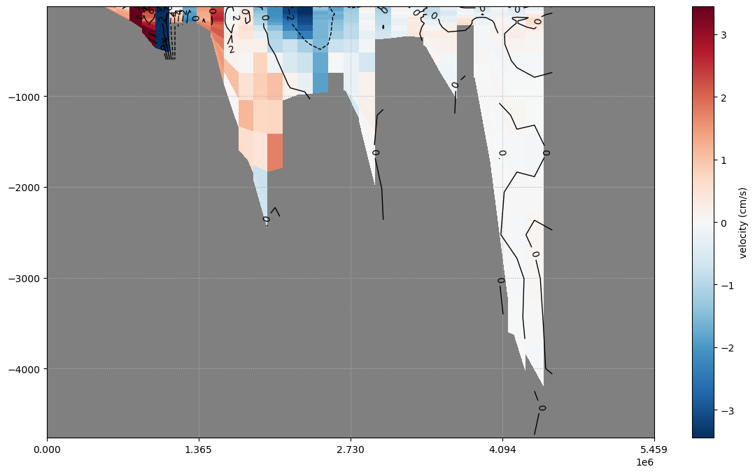
Fig. 2.22 Plotting of mean velocity on gridded section